
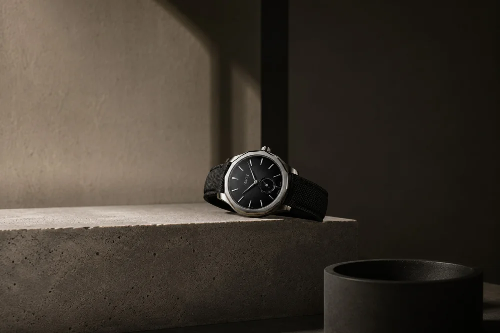
When we decided how Auret would look in photography, we started with what we wouldn't do. We wouldn't exaggerate. We wouldn't fill the frame. We wouldn't compete with the watch for attention — because in any Auret image, the watch is the only protagonist.
That's where today's principles came from: clean compositions, with enough negative space for the eye to breathe. Controlled side light, revealing texture and volume without distracting from it. Real materials — concrete, ceramic, wood — that add depth simply by being what they are.
The first image we produced under these principles was simple: a black Mederi resting on the edge of a concrete block, a single line of light crossing the scene. Nothing else is in frame. Nothing else needs to be. For us, luxury never needs to raise its voice — it only needs to be looked at with the attention it deserves.
That same discipline extends to every application of the brand: the site, the packaging, how we speak. Fewer elements, greater impact. It's an uncomfortable rule to follow, because it's always easier to add than to remove. But it's the only way to protect what makes a watch feel timeless.
Every image should feel contained, quiet and carefully built.